As Hard As We Try Biased Maps Are The Normal!
No matter how intelligent we are or how much pride we find in our critical thinking skills, there are always a few things we simply take for granted as entirely objective rather than somewhat subjective. A prime example of this? Maps.
Because we saw them in school and books and were taught to view them as a reliable, unchangeable source of information, we just assume that’s true. The reality is quite a bit more complicated than this, though. Maps are actually rather biased pieces of information and can vary significantly from the facts of the matter.

Can’t quite grasp how that’s possible? Well, we’re here to shed a little light on the subject. Keep reading to learn why maps are biased and how that comes across in both their visuals and presented information
Map Bias In Action
Before we get into the ‘whys’ of the matter, it always helps to have a working model for what map bias looks like in practice. And – luckily for us – there’s a perfect example to be found in something called the Mercator Map.
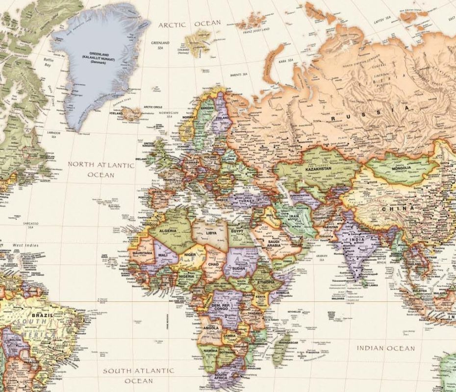
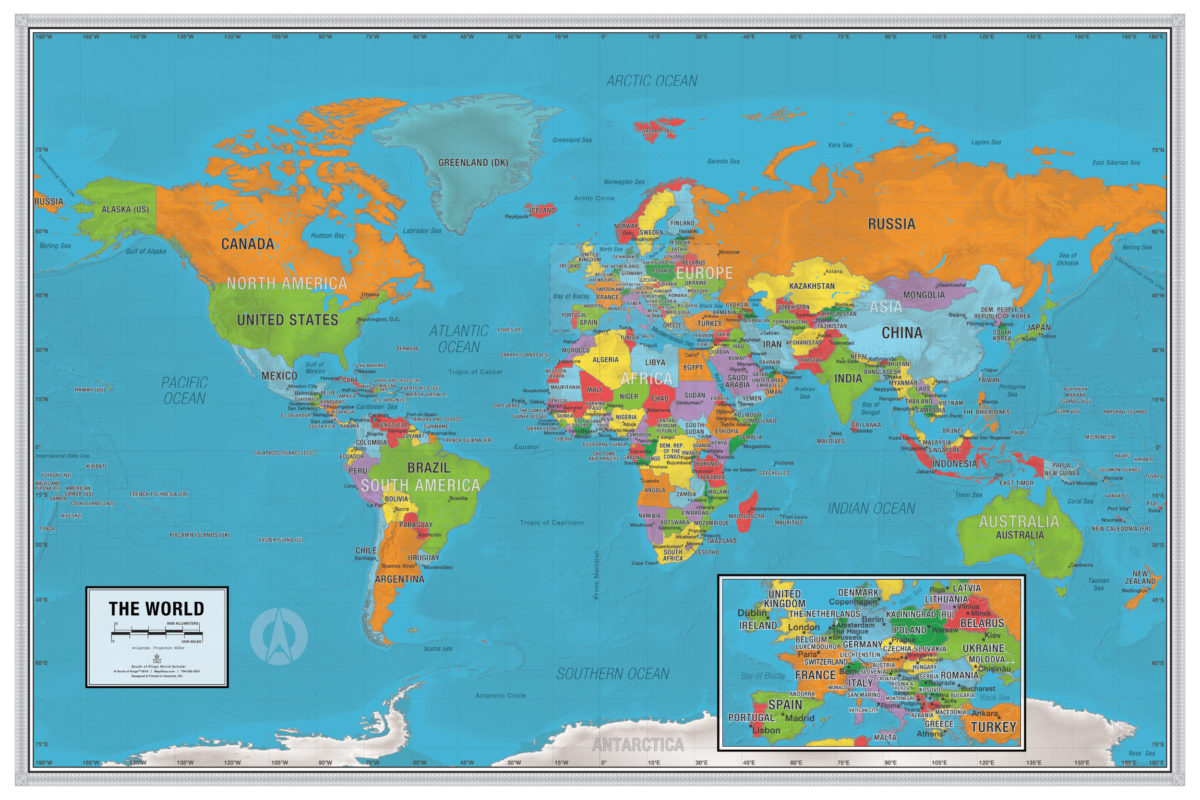
What is that? To sum it up, the Mercator Map is pretty much the world map that everyone knows. It’s the one you picture in your head, the one you learned in school and probably refer to even today: World Scholar Wall Map
Where It Started
Its origins can be traced all the way back to ’69 (1569, to be exact), created by Flemish cartographer Gerardus Mercator for use in ocean navigation. Unlike other maps of the time, Mercator’s featured latitudinal and longitudinal lines that were 90-degree angles and moved away from one another as they moved north and south of the equator. This allowed for easier, more practical navigation.
The problem, however, is that this also makes the map a complete mess for any other use. The varying distances between lines severely distort landmasses, inflating the size of things as you get further away from the equator.

For example, little Greenland? Mercator’s map portrays it as nearly the same size as Africa. And the European continent? It looks about as big as South America, even though South America’s roughly twice its size. The map even makes the equator look like it runs through Florida rather than places like the Congo. Yeah, that’s an issue.
But nobody seemed to get the memo at the time, nor much later. Because ocean navigation was so crucial at the time, the Mercator projection became the gold standard. It became an absolute essential and nothing would get rid of it – not even the more accurate projections that came into fruition throughout the years following Mercator’s. It would take centuries for any other projection to take hold, showing the power of map bias in both creation and use.
The Human Element
So, now that you know a little bit more about what map bias looks like in action, you can learn more about why maps such as Mercator’s are biased in the first place.
One of the most significant factors can be entirely attributed to the “human element” that’s a part of mapmaking. What do we mean by that? Well, maps – like anything else in our world – are human creations. They aren’t made by some all-knowledgeable, all-objective being. They’re created by real people and are impacted by all the realities that come along with that.
How they represent things is influenced by practically everything about us. They reflect our mistakes and miscalculations, our perceptions and biases, our intentions. They might be remarkably close to reality or extremely skewed, either for useful purposes like Mercator or for more nefarious purposes like national propaganda, land treaty negotiations, etc.
It’s entirely dependent on the mapmaker and what they’re trying to get across in their maps. And this bias? It’s incredibly problematic because people rarely question what they see on a map. The assumption is that it’s objective and factual, so they naturally accept it as true. But if Mercator taught us anything, it’s that you can trust it far less than you can throw it.
The Representation Debacle
This so-called human element isn’t the only source of map bias. There are also a couple more innocent causes, one of which is the problem of representing 3D information in a 2D format.
After all, whether the flat-Earthers want to accept it or not, our Earth is round. It is a 3D object. It has curves, which completely change measurements, positioning, and more when compared to flat objects. This makes cartographers’ jobs especially difficult as there’s no way to translate this into a perfectly-represented picture.
No matter what you do, 3D objects can’t be projected onto a flat surface without some level of distortion. That means there’s an inherent bias there, one you can manage but never fully mitigate. Mapmakers can then only decide what distortion is “acceptable” for their purposes and go with it, opening them up to further intentional bias.
There’s also another issue of representation at stake here. Maps represent huge chunks of visual information but in a tiny package. After all, you’re shrinking down vast landmasses/locations onto images that are barely a fraction of this size and have to sum up complicated relationships in a single picture.
Of course, a lot gets left out in the translation. That’s part and parcel of the whole experience. Maps are a generalization, a summary, and simplification of something much too difficult for us to grasp, communicate, and learn otherwise. They physically can’t be totally objective, as no generalization can be.
The End Result of It All
Maps are biased, sure. But what’s the big deal? Why does it even matter? It matters because maps affect our worldviews, and thus their biases do, too.
That Mercator map, for example? It has wholly morphed our perspective of other continents and countries. It’s provided us with a very Eurocentric view of the world, emphasizing North America and Europe while minimizing developing areas like Africa and Southeast Asia.

That’s bad enough on its own, but this kind of misleading visual information and map bias shapes our thoughts, feelings, and importance. After all, once you control perceptions, you can control people. And that is a dangerous game, one that usually arises from and supports ignorance, greed, and division. Not good, to say the least.
It doesn’t have to be like this, though. Maps may be inherently biased, but that doesn’t mean they have to generate such a negative impact. By mapmakers being aware of their power, they can keep representations at least fairer and more accurate, protecting knowledge from such high subjectivity levels.
And by you being aware of map bias in the first place, you can seek out more accurate portrayals and stay mindful about things when faced with those that are less so. It’s just the more responsible way to consume knowledge.
Did you like our travel tips? Let us know how we did and visit our website for more about travel, geography, mapping, and more!


