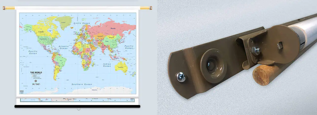
#060A US Population Changes, 1950-1994
Price range: $69.99 through $709.99
Returns
We want you to love your map. If you aren't satisfied, returns are accepted within 30 days for unfinished products.* Please contact us within 30 days of receiving your product to receive a return authorization number. Please note that shipping costs are non-refundable unless we made a mistake with your order.
*Finished products such as railed, mounted, and framed maps are not returnable because we make these on-demand just for you and do not stock them. If you have any questions about whether your order qualifies for a return, please contact us.
Map Finishing Options
Transform your wall map into a ready-to-hang centerpiece! Our professional framing and railing services often cost less than visiting a local framer. Choose your finishing option during checkout and receive your map ready to display immediately and hassle-free.

Paper
Paper finishing is the most economical option. Most maps are printed on premium 36lb paper. Waterproof paper is also available for functional maps that may be used outdoors.

Laminated
Maps are printed, then run through our laminator that applies 1.7mil-thick satin-gloss lamination to the front and back. You can use map stickers and wet-erase markers.

Mounted
Maps are printed, then laminated with 1.7mil-thick satin lamination onto 1/4″-thick foam core. You can use map pins, stickers, or wet-erase markers with our mounted maps.

Laminated with Rails
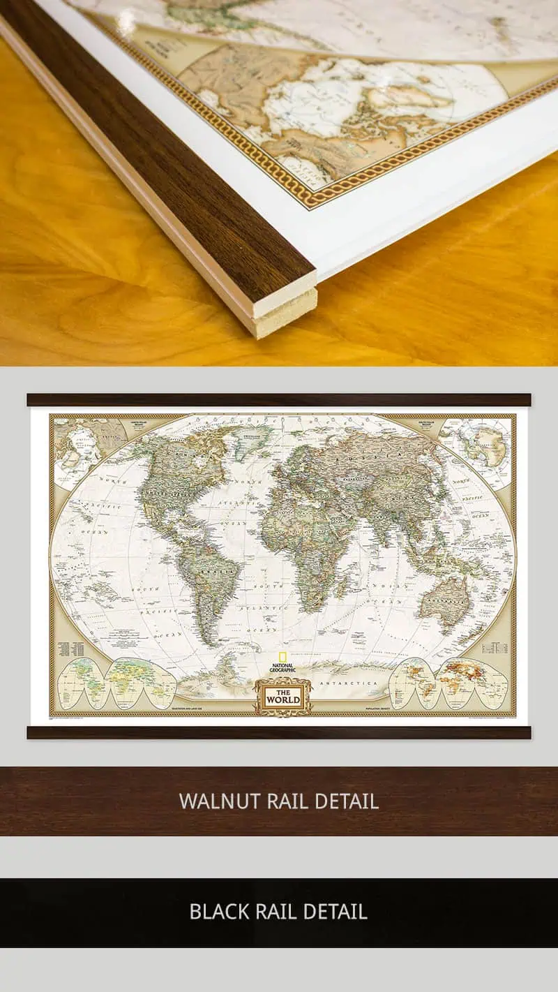
First, we laminate the map, then mount wood rails at the top and bottom. The front side of each rail features a black or walnut finish, while the sides and back are unfinished wood. Sawtooth hardware is attached to the back of the top rail so it's ready to hang. You can use stickers or wet-erase markers on your laminated map. We recommend a mounted or framed option if you'd like to use map pins to mark locations.


Mounted with Rails
First, we laminate the map onto foam core, then mount wood rails at the top and bottom. The front side of each rail features a black or walnut finish, while the sides and back are unfinished wood. Sawtooth hardware is attached to the back of the top rail so it's ready to hang. You can use map pins, stickers, or wet-erase markers on your map. This option will lay clean and flat against the wall, unlike the laminated with rails option.

Framed
Maps are laminated onto foam core, then secured into the frame. The engineered molding is made from recycled wood in either a black or walnut finish that wraps around the entire map. Most moldings are 2″ wide by 3/4″ deep, but maps 24″ x 36″ and smaller use a 1.25″ wide molding. You can use map pins, stickers, or wet-erase markers on all our framed maps. Ready-to-hang sawtooth hardware or wire hanging loops are included.